
In 2021, I took the lead in redesigning the main navigation of our SaaS platform, Voltax.
The first phase of the new navigation was implemented in Voltax in 2022, and it sparked a shift towards a new approach to the overall design and user experience of our product across the company.
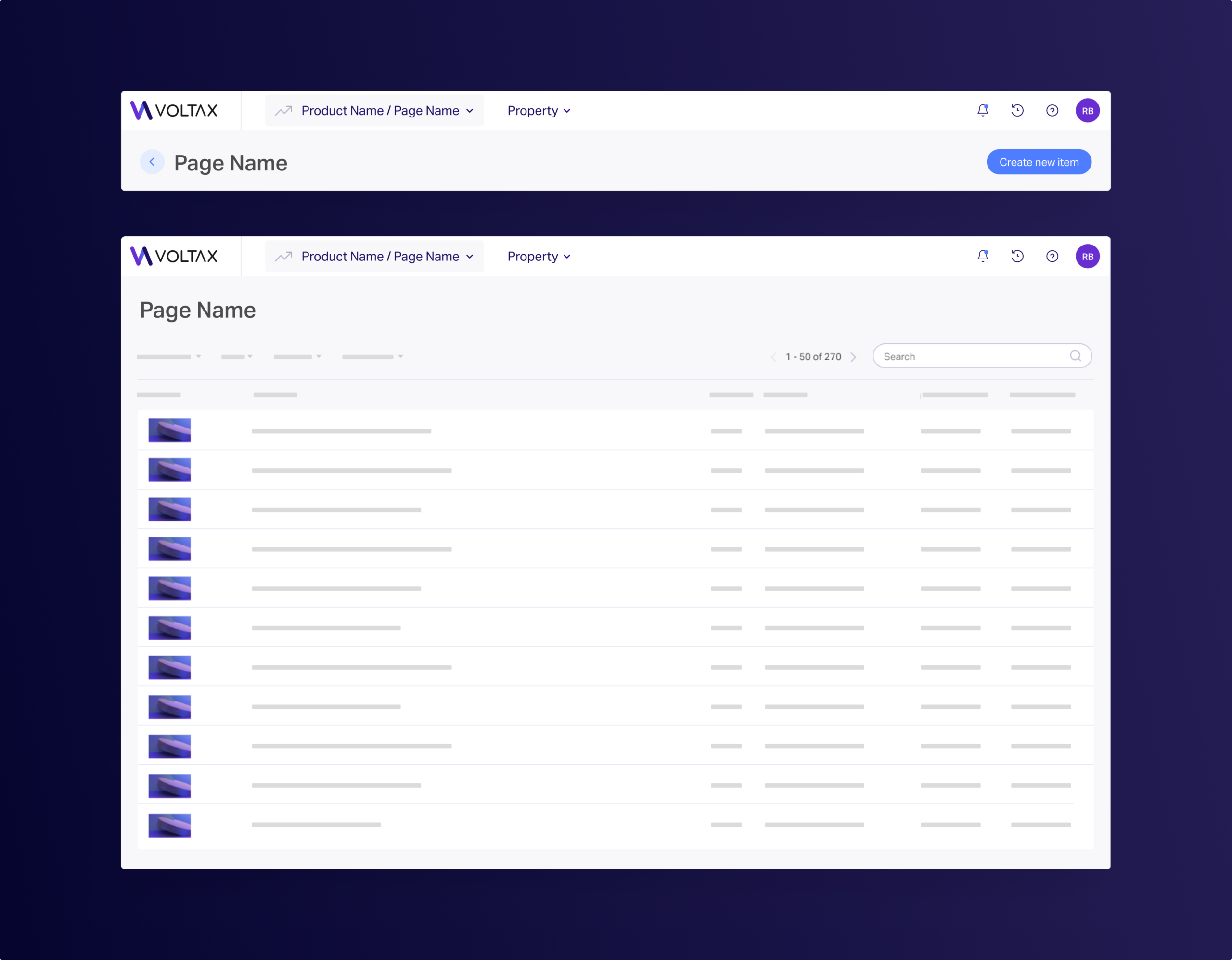
The design team at Voltax, have long knew that our main navigation is not ideal.
Regardless, it was not until recently that the issues with the old design became more prominent-
as we’ve expanded our audience and range of products, it became clear that the navigation no longer serves our users or our business.
This meant the whole team was very invested in the project, and it was important for me that all designers were fully confident with the final design.
“I start every day by checking for updates on articles from the past days, usually takes 15 minutes or so.”
In addition to feedback from the Content Manager persona, we also identified three key pain points of our everyday users:
From conducting user interviews I discovered that Content Managers at Minute Media spend a lot of time tracking and chasing updates on articles. I based my concept to the navigation redesign on that insight:
Simplify the process of tracking their writers’ and editors’ submitted & published articles.
In order to ensure the new design is ready to go, we conducted further testing on some of our users. Our main question was, is the “basic” version of the new navigation easier to use than our old one?
The way we tested that is by giving users tasks, some easier and some more complex, such as:
and more.
The testing involved having participants complete tasks using a high-fidelity prototype I designed on Figma.
The results were positive, with participants finding the navigation easy to get used to, and more efficient than our ‘old’ navigation overall.
We also received feedback and suggestions for further improvements which were incorporated into the final design.
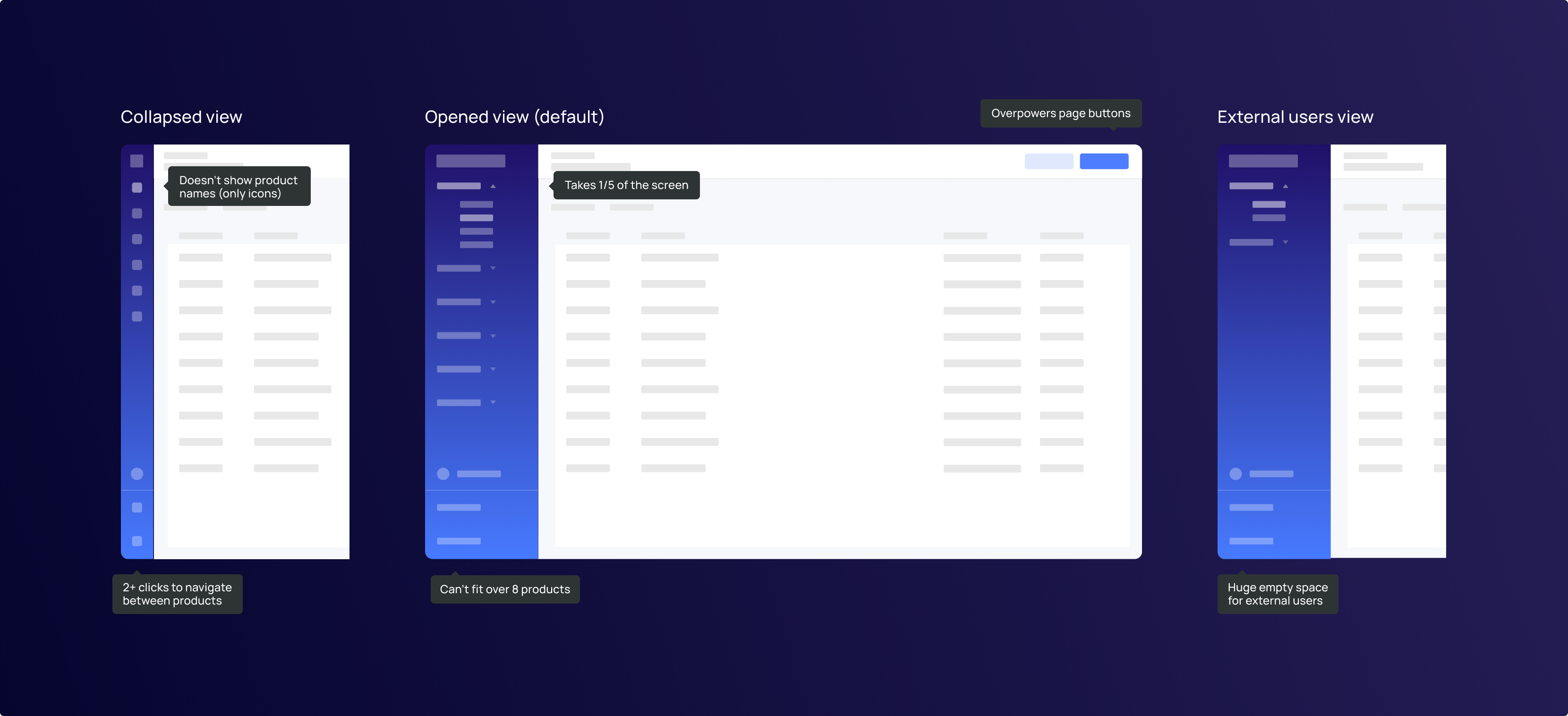
When designing the new navigation, my top priority was to ensure that our users would feel comfortable.
I put a lot of thought into how I could make the design feel ‘native’ to our product’s overall look and feel.
I made sure that the design was visually appealing not only to customers who might have access to only 1-2 products, but to our internal large-scale users as well.
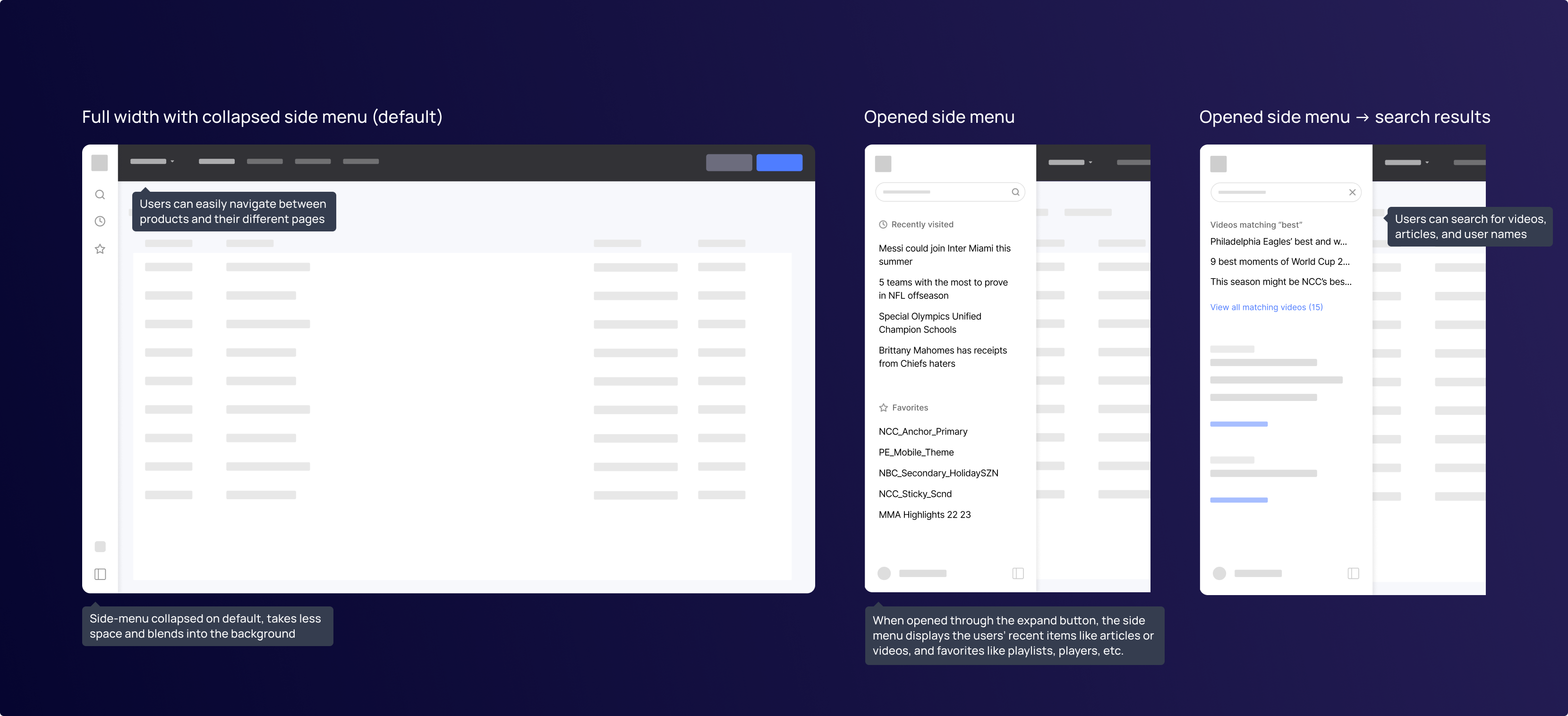
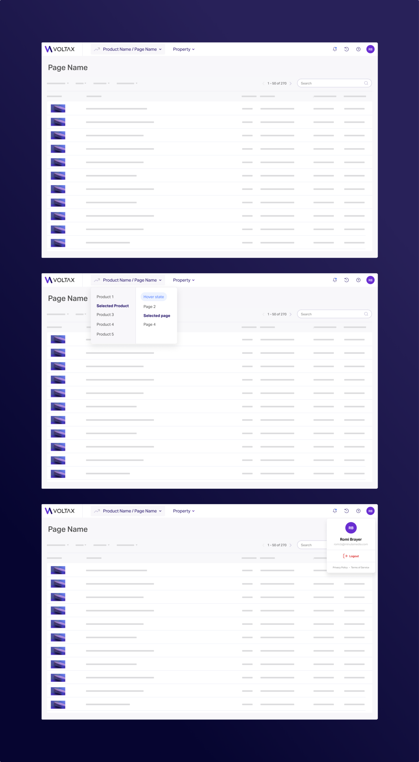
After finding through our testing that the side menu concept isn’t necessary, we decided to ditch it completely, moving the Recents and Updates (now Notifications) features to the header.
As part of an accessibility initiative at CurseForge, I created Colorblind themes for the CurseForge app that significantly improves usability without requiring complex technical support.
I led the project end-to-end as the sole Product Designer, working closely with Product and Engineering stakeholders.
