As part of an accessibility initiative at CurseForge, we set out to improve our desktop app’s accessability and reduce long-standing visual issues.
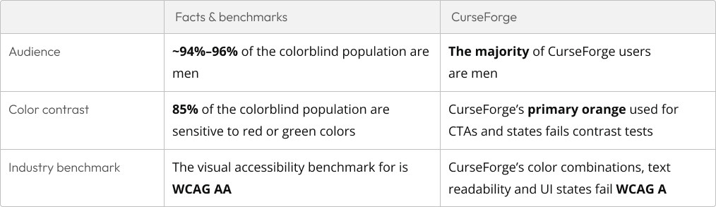
Colorblind support was chosen as a starting point for being a low-effort, high-impact feature that could significantly improve usability without requiring complex technical support.
I led the project end-to-end as the sole Product Designer, working closely with Product and Engineering stakeholders over two quarters.
Project Lead • Product Designer
Problem
Accessibility gaps in CurseForge
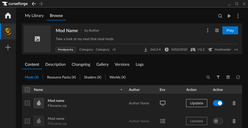
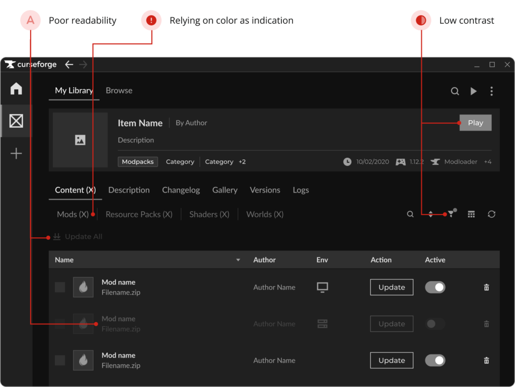
The CurseForge app violated multiple WCAG basic accessibility standards, many require technical support which isn’t planned for the near future. Therefore, I researched solutions to improve the app’s accessibility with low development effort, that would make a significant visible impact.
Research
Constraints and opportunities
I studied the WCAG guidelines and accessibility best practices, as well as reviewed how other widely used products handle accessibility. These findings, combined with our core fundamentals shaped my decision to focus on colorblind accessibility as a solution.
Solution
Fixing color and contrast issues
After identifying multiple WCAG violations, I proposed fixing inaccessible color combinations and improving text readability for high, scaleable impact.
These issues were not only accessibility gaps but also affected overall usability for all users. Instead of changing these in our global design system, we opted for colorblind themes first, for faster impact and lower development effort.
Design
Designing dedicated colorblind themes
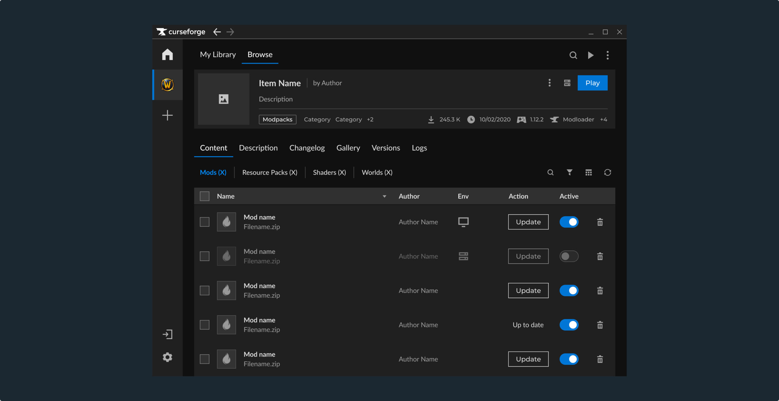
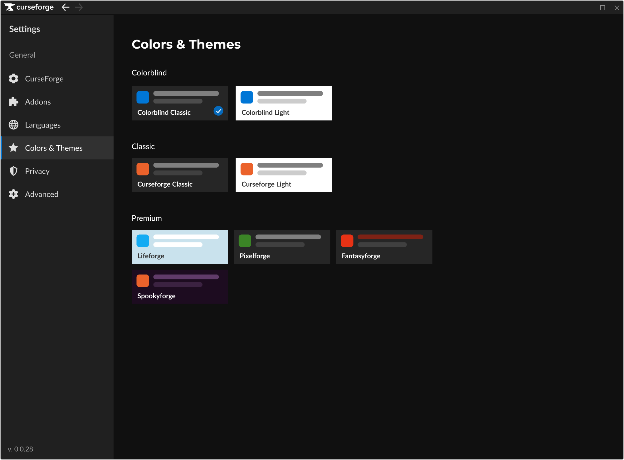
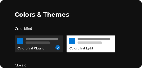
Colorblind themes were presented and agreed upon, with a caveat – UI improvements would make a partial WCAG AA compatibility. Without technical support such as keyboard navigation, font resizing and more, this solution is not enough for full accessibility.
The feature was implemented as a set of color overrides for our “problematic” colors and color combinations. The changes addressed critical issues such as text contrast and primary action colors, while local adjustments were made only where color affected clarity or meaning, not aesthetics.
Design principles
All Text and actionable objects must always meet contrast standards
States must be distinguishable without relying on color alone
Changes must work in both dark and light themes
Decorative colors that do not affect usability can remain unchanged
The original idea was a single Colorblind Mode toggle, but it created confusion around how it would interact with premium themes.
To avoid unclear expectations and protect Premium value, the solution shifted to two Colorblind Themes, one light and one dark, available to all users.
The primary action color was updated to blue to ensure sufficient contrast with both light and dark themes.
The new color meets WCAG AA requirements and is easier to distinguish for users with red–green color sensitivity.
Light borders were added to interactive objects like checkboxes and toggles that appear on top of gray backgrounds, improving visibility.
Validating
User testing & audit tools
After validating our colorblind themes using the same audit tools as used in the research, the next step is usability testing with colorblind participants in real workflows.
The testing will focus on the app’s main flows with at least 10 participants with Deuteranopia and Protanopia, the most common forms of color vision deficiency, to red or green light.
Success Metrics
KPIs & results
Since the feature is still in development, success is defined through measurable accessibility and product goals:
Partial WCAG AA (UI only) compliance for color and contrast across the supported themes
Adoption of the colorblind themes after release (target to be defined)
A scalable color system that supports future improvements and additions (to be tested ongoingly)
Next project
Optimizing User-Moderation Interaction in CurseForge
CurseForge by Overwolf is the leading UGC platform for both Content Creators and Gamers.
In August ‘23, as part of our mission to prepare the platform for more games, I researched and designed solutions to optimize user-moderation interaction in CurseForge.
CurseForge by Overwolf is the leading UGC platform for both Content Creators and Gamers.
In August ‘23, as part of our mission to prepare the platform for more games, I researched and designed solutions to optimize user-moderation interaction in CurseForge.